A quick guide to A/B testing

Grow fast, scale quickly, instantly deliver results, catch trends immediately, change profiles, adapt. It seems the book "How to make a startup unicorn in one day" will be out of print any day now.
How can one focus on their product development and understand whether the right motion vector has been chosen in such conditions? Are we marking time? Or even worse - are we already rolling back?
Of course, everyone who knows how to use Google will find the rescue here in the form of a bunch of metrics and helpful practices (from which product analysts have already built a separate religion), which, if used correctly, are excellent tools. Today we're going to talk about all (marketers) favorite A/B tests.
Why are A/B tests needed?
Intuitive guesses from the field of how to “make a client happy” or make his life comfortable are often built based on personal experience, views, and vision of ICP. And they will not necessarily be understandable and close to the actual audience of our resource.
In other words, our assumptions do not mean at all that we will get the expected result after making changes.
A/B testing is a way to test how well our ideas work for our clients and increase the conversion of existing traffic.
It should be noted right away that this method is based on the analysis of statistical data. Respectively, the more resource traffic, the more accurate data will be obtained.
If the traffic is not large enough, you can extend the test time to collect the required amount of data, but it is better to start not with optimization but with increasing (building-up) traffic.
A/B testing step-by-step:
Preparatory stage
1 - Define the optimization zones (what we want to improve) and prioritize (in what order we will improve, which is more/less important), based on the indicators that you want to improve.
Most often, these are conversion, economic metrics, or behavioral factors.
If a conversion is an indicator that everyone is equally interested in, then economic metrics are mainly of interest to online stores (revenue volume, average check per number of visitors), and behavioral metrics allow us to assess user interest in a resource (number of viewed pages, pageview depth, duration of one session). One should be careful here - one indicator is not always enough to assess the effect of the changes made, so it is crucial to monitor several key indicators.
2 - Draw up a prioritized list of hypotheses (how we will improve).
3 - Create alternative versions of pages that include ideas that need verification.
4 - Testing itself; collecting and analyzing data.

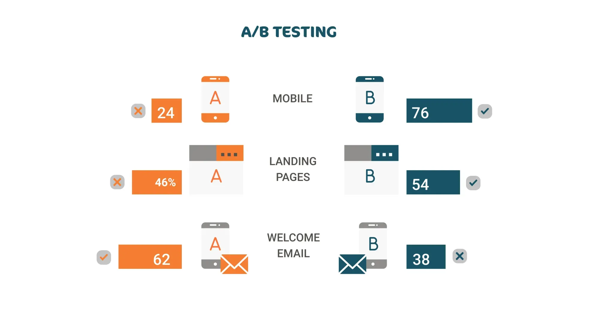
Resource users are randomly divided into segments:
A - The control group, with which we will compare; users for whom everything will remain the same.
B - Users who will be shown the new version of the resource.
The audience splitting can be disproportionate if the changes are very significant or there is a high likelihood of having a negative effect (updating an outdated design or a new navigation system).
Thus, the testing covers both: minor changes such as the shape and color of the buttons, the length of the headings, the types of fonts used, the layout of the blocks on the page, as well as the algorithms for issuing results and recommendations based on the habits and preferences of users.
Since the users see either a baseline or a revised version, we can easily assess the impact the change has had and decide if the change is appropriate.
Here's a base you need to know about A/B testing.
The main thing is to understand WHAT, WHY, and HOW we plan to change. Define a list of expected RESULTS and INDICATORS that will allow them to be assessed.
Want to A/B test your ideas?


