Avoid These: 10 Design Mistakes in Pitch Decks

Even if you possess the most valuable information in the world, it will remain useless if you cannot convey it correctly. The design of your Pitch Deck is crucial: it determines whether your audience will perceive information about your startup and whether you can communicate its true value.
The secret to a successful presentation is to make people listen by telling them the truth in the form of a story and accompanying it with expressive visuals!
So, let's look at the 10 most common design mistakes in presentations and provide advice on how to avoid them.
Mistake 1: Too Many Elements on One Slide
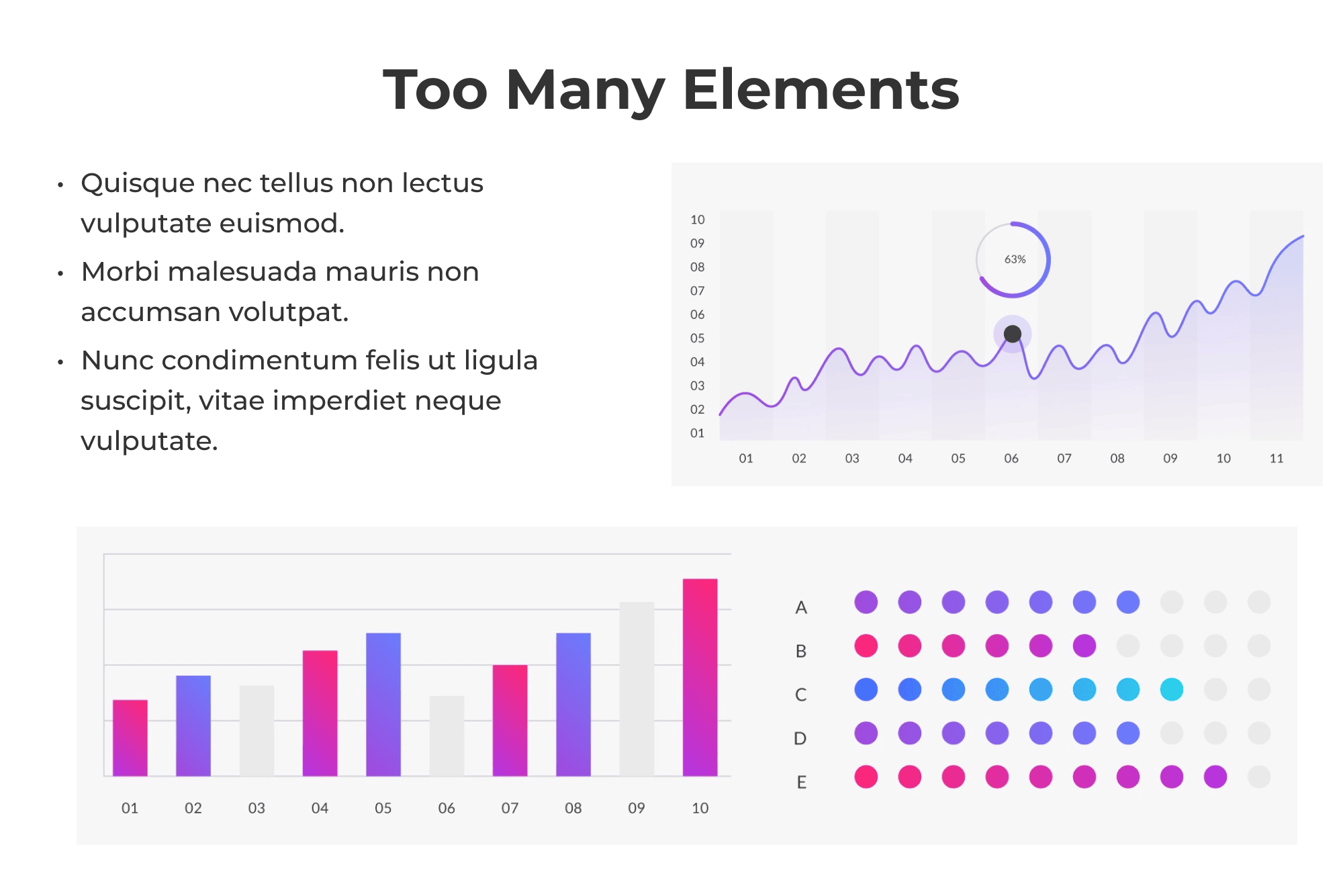
Too much text, images, or graphics on a slide will distract attention and make it difficult to focus on the main message, confuse details, and perplexe the audience.
Overloaded slides look unattractive, disorganized, and unprofessional.
A presentation slide is just your support during your talk. If the audience is reading text paragraphs that you've squeezed onto a slide it means they are not listening to you. Don't bombard your audience with unnecessary information!
Tip: Follow the rule: one message - one slide. Keep the design of the presentation concise and minimal. Limit yourself to one idea or statistic per slide.
Give more white space, a room to "breathe." Don't bring the text right to the edge; leave a small space between the headings and the main text. If you have graphics on the slide, make sure it has free space around it.
For the central part of the presentation where you showcase solutions to a problem, you can apply the rule of three: three keywords, three characteristics, three sections, etc. By the way, Steve Jobs was known for using the "rule of three" in his presentations. For instance, in 2011, he described the iPad 2 as "thinner, lighter, faster" than the iPad 1. These three adjectives were effective. They expressed everything the viewers needed to remember when leaving the presentation. It is much more successful than if he had announced: "20 differences between the iPad 2 and its predecessor."
Mistake 2: Text-Only Slides
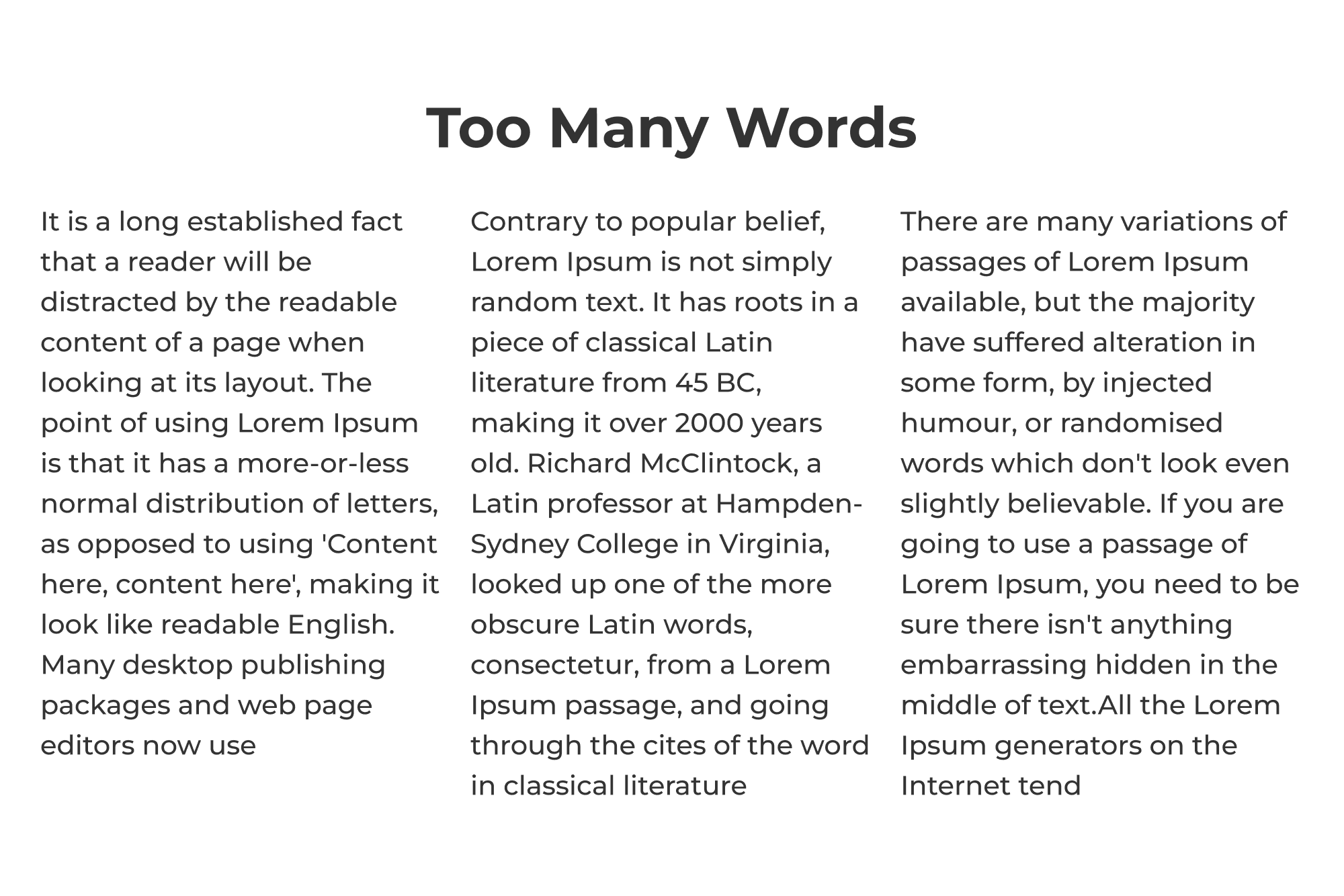
It's boring and monotonous. The audience loses interest in such a presentation, and it can be rather challenging to absorb the information. Text-only slides also have very low memorability as they lack visual associations.
Most investors are scanners; they don't have time to read entire paragraphs, so they quickly browse your presentation in search of visual materials, highlights, and solutions.
Tip: Text-only slides should be used very sparingly and only in extreme cases. Even if you use them, the text should express one idea. It should be fundamental phrases and no more than 10-15 words per slide. Slides with text alone should have contrast for better perception - read more about this below.
Mistake 3: Lack of Contrast
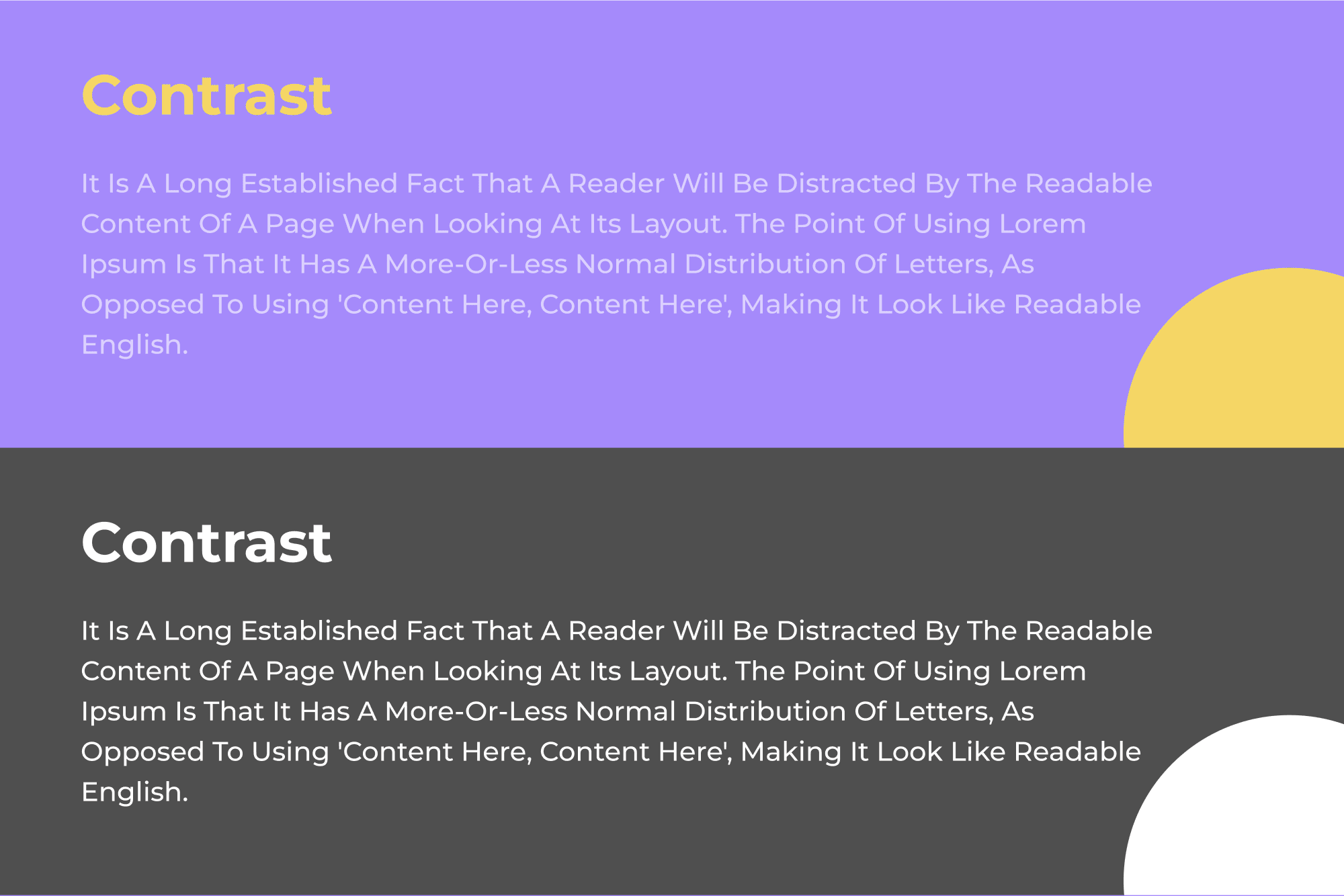
The absence of contrast between the text and the background can make the text hard to read, especially in limited lighting conditions or from a distance. It can also lead to audience fatigue and a loss of importance for specific elements.
It's all about the way the human brain works. Instead of capturing the entire span in front of us like a camera, our eyes primarily latch onto key elements/forms that stand out the most.
That's why our brain processes information by comparison, difference, or contrast. So, contrast, contrast, and contrast again! Think about your favorite section: "before/after."
Tip: Avoid using color combinations that reduce contrast and ensure your slides have an adequate level of visible contrast between text and background. Highlight headlines, keywords, or numbers to improve attention concentration.
To evaluate the contrast in your presentation, you can use online color checkers, such as Adobe Color Wheel, Paletton, Color Safe, WebAIM Color Contrast Checker, Accessible Color Picker, Contrast Ratio Calculator, ColorHexa, and others.
Be especially careful with contrast when using images as a background for text. Clarity becomes even more critical if you're adding text to your photo. You can ensure this by adding a black overlay with 60% transparency, making the image darker and the text easier to read.
Mistake 4: Too Many Colors on One Slide
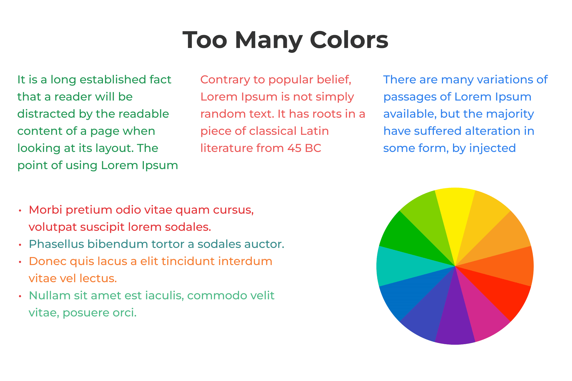
Having too many colors on one slide can create a visual barrier for the audience. People may lose the ability to quickly perceive and understand information when a screen resembles a chaotic kaleidoscope of colors.
There's a misconception that presentations must be vibrant. When choosing bright colors for your palette, it can be challenging to combine them effectively. Experts recommend to use not more than three colors on a single slide. Ideally, you should adhere to this rule throughout your entire presentation.
Tip: To ensure your presentation looks aesthetically pleasing. You can use color combination charts freely available on the internet.
It can be challenging to follow the rule of three colors when creating diagrams with multiple categories (segments). On one hand, you need to color them so they differentiate from each other. But on the other hand, you have the background, logo, and other colorful elements. You can solve this problem using shades. Color the most significant elements with intense colors and the smaller ones in paler shades, and so on.
Mistake 5: Lack of Alignment
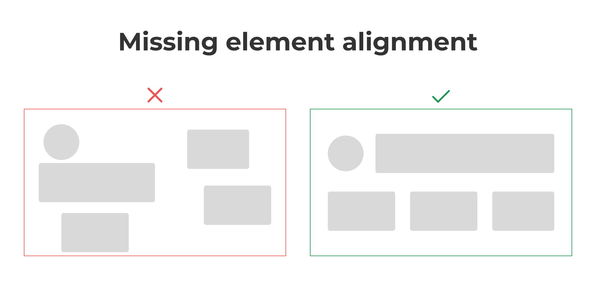
Haphazardly placing various elements on a slide creates an impression of carelessness and unprofessionalism. In contrast, meticulous alignment, consistent formatting, and a clear distribution of objects can significantly contribute to a sense of calm for those absorbing the information. Alignment makes the presentation look more professional and polished.
Tip: Carefully align elements to each other and use distribution tools to space them evenly. Apply the same spacing and alignment to the rest of your presentation's slides. Proper alignment helps create visual harmony on the screen.
All elements (text, images, graphics) can be aligned horizontally or vertically, making the slide more attractive and easier to perceive. HOWEVER, regarding the main text, avoid the urge to justify the text width-wise. It may look neat, but it's harder to read and creates uneven spacing and hyphenation. Therefore, always make the text left-aligned (PowerPoint calls it "left alignment").
Mistake 6: Using Different Fonts Simultaneously
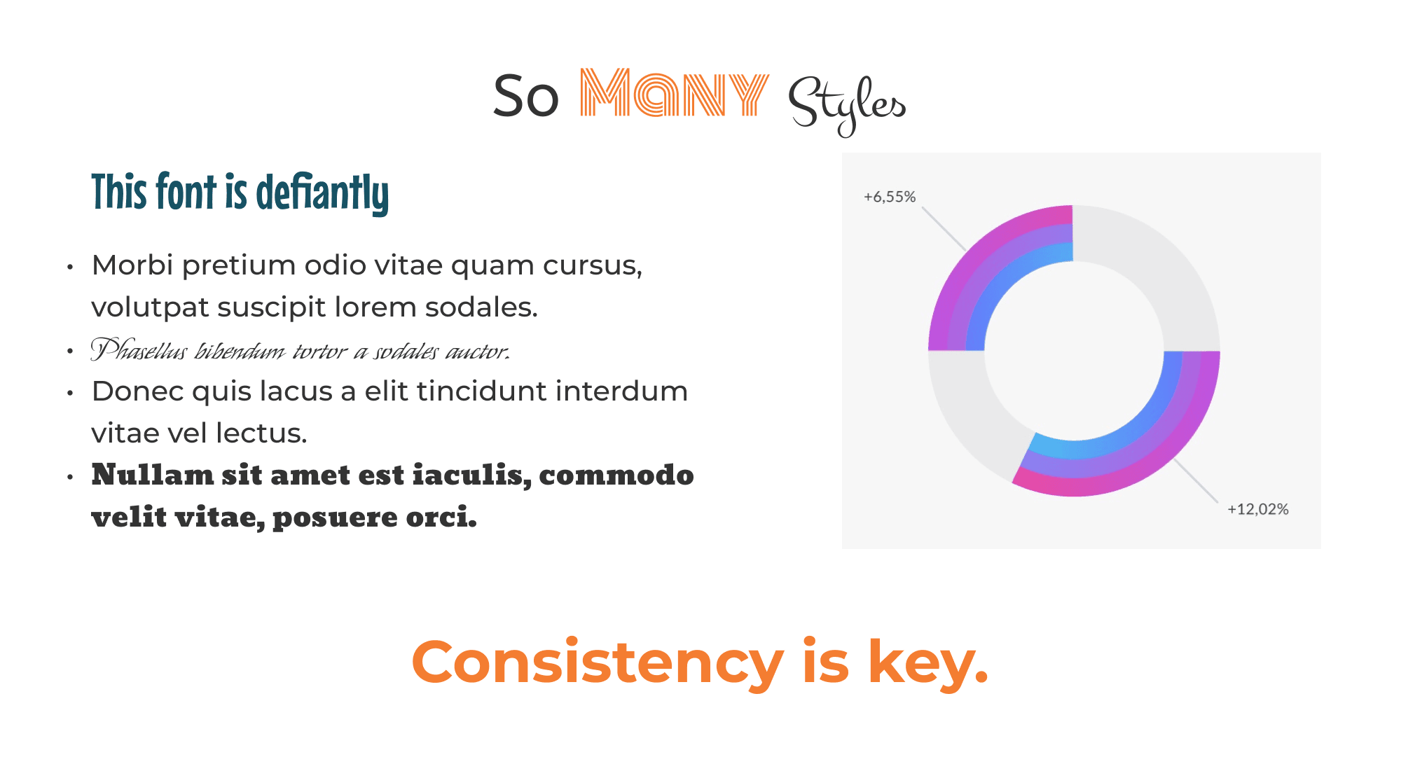
When a presentation uses more than two different fonts at the same time, it doesn't convey integrity, organization, or the company's confidence. Each font has its own style and character. Using many different fonts risks losing the design's equilibrium, which is crucial for creating a unified appearance and style.
Additionally, each font has a psychological impact on the audience, potentially triggering various associations and emotions. Therefore, it's vital to choose fonts that match your message and create the desired mood.
Tip: Experts recommend using two main fonts in presentations, one for headings and another for body text. This helps ensure consistency, highlight important elements, and enhance readability. If you need to emphasize specific elements like quotes or key phrases, you can use formatting (italics, bold) and colors instead of introducing new fonts.
Here's another crucial point: you can use any font (paid, free, custom), but remember that someone viewing your presentation might not have the same font you used. In such cases, there could be automatic font substitution, or the text might become unreadable. Therefore, using system fonts that come with Windows or Mac, such as Arial, Verdana, Calibri, Times New Roman, etc., makes sense for presentations.
Your goal with fonts should be promoting legibility and creating contrast. Combining a serif font (e.g., Times New Roman or Georgia) with a sans-serif font (Arial, Verdana, or Tahoma) is often a successful combination. The contrast between two similar fonts can be an effective way to highlight, for example, headings.
So, choose one font for headings and another for body text, and keep them consistent throughout ALL your slides.
Mistake 7: Using Small Font Sizes
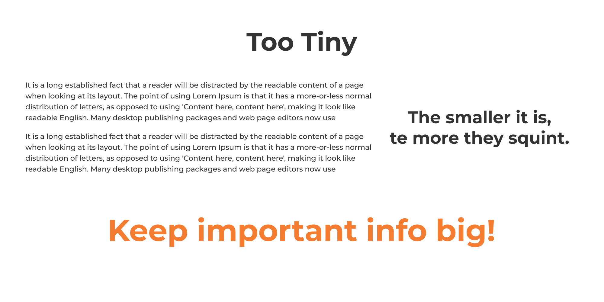
The most significant problem with small font sizes is their low readability, which leads to issues with information perception and trust in you as the presenter. Your slides are meant for your audience, so ensure they can read them!
Headings should be eye-catching, meaning they should be large, concise, and stand out from other text on the slide. The body text can be smaller, but it still needs to be legible from the farthest corner of the room.
Tip: Guy Kawasaki's "Golden Rule" 10/20/30 recommends a font size of 30 points. According to him, a smaller font might lead to a lack of synchronization between the speaker and the audience since people read faster than they speak. Moreover, keep in mind that your audience will remember 80% of what they see and only up to 20% of what they read. So, minimize text and focus on the core message with a larger font. Use a large font size and limit the number of words on each slide.
In general, most experts recommend the following optimal font sizes:
- 36-44 points for headings.
- 24-32 points for the main text on slides.
- 18-20 points for explanations or notes (secondary information).
Your presentation should be readable for all listeners, regardless of where they are sitting. Therefore, before presenting your slides, test them visually from various distances.
Mistake 8: Insufficient Visual Content
It's a case where seeing once is better than hearing a hundred times. Human physiology heavily favors visual information. Several pieces of research support this:
- 90% of information is perceived through sight.
- Around 70% of sensory receptors are in the eyes.
- Nearly half of the neurons in the human brain are involved in visual information processing.
- People are 17% more productive when working with visual information.
- Visual information is processed about 60,000 times faster than text.
- 10% is retained from what is heard, 20% from what is read, and 80% from what is seen and done.
- People perform 323% better following instructions when they include illustrations.
So, what more evidence do you need?
Tip: Use more visuals in your presentation projects. At least 75% of your presentation should consist of visual images. One powerful photograph can replace a thousand words: it conveys emotion, tells a story, has an impact, provides information, and prompts action.
Here are some additional tips:
- Choose diagrams over tables. Tables often have a stark, office-style appearance. They typically start with a column labeled "#," followed by dense grids filled with small text. Diagrams can be presented in more engaging colors, making them easier to perceive.
- Icons are better than text. Where possible, use icons and other images. They need to be easily understood and not cause ambiguity. Following this rule, logos, city coats of arms, and national flags are better than text.
- Photos are better than drawings. Artificially created illustrations may not convey the full range of emotions and details a high-quality, authentic photo can. When possible, use photographs rather than pieces of clipart.
However, be cautious. There's a risk in using overly staged photos, making your presentation appear insincere. You might unintentionally use copyrighted images, which could lead to legal complications. Be mindful of these factors when selecting visuals.
Mistake 9: Inappropriate Use of Animation
Animation makes sense in cases such as highlighting specific product functionalities, creating a story with illustrations, and animating graphs or statistics for comparison. However, in general, it is not recommended to use animation because:
- It slows down the presentation, especially when you add transitional animations after each slide.
- It distracts the audience while you build your argument or story.
- It can be perceived as unprofessional, particularly in a business context such as seeking investment from potential investors.
Tip: If you decide to use animation in your presentation, ensure that it helps you achieve your goals and emphasizes your message rather than distracting from its content. Avoid using multiple animated elements on one slide.
Also, make sure to check the compatibility of presentation tools in advance. Animation may be disabled or not supported on devices or platforms where you'll be delivering your presentation.
Mistake 10: Forgetting Your Branding
If you forget about your branding, investors might ask, "Who are you?" Then your presentation will be a waste of time and money. You, as the author of the presentation; your business, and your solutions are the best, and you need to leave an impression on the investors. So, YOU (your brand) should be present in your pitch deck.
Branding includes your logo, color scheme, writing style, and other defining elements of your business. Using these elements in your presentations helps maintain your corporate identity and makes your brand recognizable.
Tip: Avoid placing your logo on each slide as it might look presumptuous, intrusive, and irrational. Just put it on the first and last slides. However, effective branding will involve the use of a color palette and corporate fonts, graphic elements, and an overall aesthetic to evoke the feelings you want to associate with your brand.
Furthermore, using branding in presentations can help create consistency with other materials from your company, such as websites, business cards, posters, merchandise, and more. That promotes uniformity and ease of recognition.
CONCLUSION
There are many of those who will advise you to use your imagination, go beyond the limits, play with colors, fonts, and images on every slide, and demonstrate your boundless creative spirit.
Do not fall into this trap.
It's like the case of an employee with many diplomas: the quantity doesn't prove that the person is intelligent or talented. It only indicates that they studied for a long time. Similar to your presentation design: it will either emphasize your strengths and focus on the main points, or it will indicate that you spent time and money on a fancy and controversial design, a flashy "wrapper" that says nothing about the "filling" of the candy, the value of your startup. Venture investors are not looking for wrappers.