How to Prepare the Perfect Pitch Deck: Part 2

Guy Kawasaki's Golden Formula: 10/20/30
Guy Kawasaki is known as one of the most famous specialists in the world in the field of marketing and business strategies. He is a marketing preacher for many popular technology brands, a successful author of more than a dozen books on entrepreneurship and branding, an investor, and a Silicon Valley business consultant.
His methodology for creating PowerPoint presentations with the 10/20/30 formula is truly textbook and has been working successfully for several decades. It is essential. It is a universal, simple but effective formula for creating exciting presentations with three simple requirements:
- Not more than 10 slides;
- Not more than 20 minutes;
- And at least 30 points of font size.
Why 10 slides?
According to Kawasaki, this number of slides in a PowerPoint presentation is the most optimal because a normal person cannot remember or adequately perceive more than ten messages during a meeting. "If you need to use more than ten slides to explain your business, you may not fully understand it yourself. Or you don't have a business," he believes.
10 slides – 10 points of explanation, with only the pivotal information on the slides. The goal is to create slides with clear, concise information.
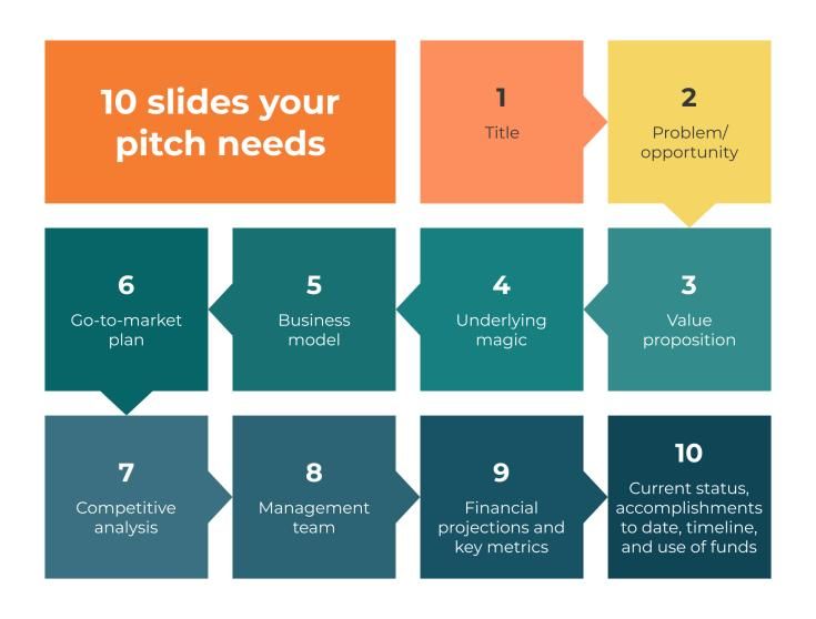
Here are the 10 slides:
Cover slide (company name, logo, catchphrase)
This first slide sets the tone for the rest of your presentation, so it should be simple and to the point. You only have a few seconds to grab your audience's attention, so make it bright and engaging.
Problem/opportunity
Entrepreneurship consists of solving certain problems. On your problem slide, you talk about the problem you're trying to solve and why it's relevant. It's all about making your audience feel the problem. It is also vital to establish an emotional connection with the audience: if you succeed in this, then, most likely, investors will not remain indifferent to your idea. If you are not solving a new problem but changing something in a previous solution to an old problem, you can show an opportunity slide instead of a problem slide.
A valuable offer
Define the key value (ideally quantified) that your product provides. Formulate a clear description of the solution to your problem. The uniqueness of the solution can be emphasized with particular visual markers. Always try to present your solution as realistically and innovatively as possible.
Basic magic
Present the unique technology, secret sauce, or magic behind the product. The less text here, the better. Use visual images, graphs, charts, tables, and diagrams. If there is a prototype or demo – show it. If you have a physical product, bring it – investors will love to try it. If there is a digital product – demonstrate it. Provide everything you have at the moment, as well as your plans for what you will add in the future. For some products, it may make sense to develop a story that demonstrates how your product changes the lives of your prospective customers.
Business model
This slide is the action plan that defines how the company makes money – for investors, and it's one of the most exciting slides. The main function of your business model slide is to explain to investors how your company works and what your business strategy is that will generate revenue for the company. There are many business models for startups. However, you need to choose the one that will best suit your product.
Market entry plan
Here, we urge you to research the numbers well and confirm them with true sources. There is nothing worse than presenting the wrong market information and making an investor listen to it by making a fool out of them. At the same time, a well-argued and truthful market slide shows the investor that you are an adequate person for the mission, as you have a good command of information, realistically assess the situation, and make the right decisions based on your knowledge.
Competitive analysis
On the competition slide, you list all the major competitors in your market and describe what they do well and poorly. In addition, you make sure that you will show what sets you apart from these competitors and where you see your position in the market compared to your competitors. A competitive analysis slide is a great place to present your benefits.
Management team
This slide helps build your investors' trust, confidence in your team and their skills. A brief biography of each key member of your team is usually provided, including education, relevant experience, and any notable achievements. If you are a startup company, you should define the key roles and positions critical to the success of this business.
Financial forecasts and key indicators
The reason why investors listen to or read your pitches is because they want you to take their money and make them more. Therefore, they are looking for profitable opportunities, first of all, for themselves, which should attract them. Provide, for example, a three-year plan not only for finances but also for key metrics, such as the number of customers, conversion, etc. Make an assessment based on the negative scenario, not the most positive one. Be prepared to discuss the major assumptions you made to reach your sales goals and what the major cost drivers are.
Current status/timeline/use of funds
Explain the current status of your product, tell about development plans, timelines, and how the money theat you want to attract will be spent.

Why 20 minutes?
According to Kawasaki, this time is more than enough to deliver a clear, structured presentation where you emphasize the essential points. By saving time on your presentation, you'll have more time for questions, technical issues, or troubleshooting that can always come up (that's life, right?).
Ideally, a 20-minute presentation leaves another 40 minutes for questions. That is an okay ratio to strive for because it encourages audience participation, not leaving them indifferent.
Here's how to use those 20 minutes effectively:
- Introduction (1 minute): Don't get carried away with the scope and showiness of the opening. Your audience already knows why they're here, so a lengthy introduction might "break" the focus of your point.
- Ask a Question / Highlight a Problem (4 minutes): Show what exactly this presentation is trying to solve. Bring out the central theme of the presentation and emphasize its importance with data and real-life examples.
- Main arguments (13 minutes): Offer information that tries to answer or solve your question or the problem you are solving. Provide visual facts and figures that support what you're saying, and transition between slides to form a coherent body of your argument.
- Conclusion (2 minutes): Provide a concise description of the problem and the suggestions you made to solve it. This part consolidates information for audience members and prepares them for questions.
Why 30-point font?
It is because, according to Kawasaki, most presentations made with a smaller kegel contain, accordingly, more text that the host reads. However, once the audience understands that you are reading the text, they are reading it ahead of you because they are reading faster than you are speaking. As a result, you and the audience are out of sync.
Also, keep in mind that your audience will remember 80% of what they see and only up to 20% of what they read, so keep the text to a minimum and capture only the gist with a large type size.
Less text means shorter sentences that are easier for readers to digest. When the font is large enough, it forces the speaker to be more selective in choosing the words and phrases they use. It also helps the audience to read and understand the presentation material more easily, especially in large rooms or if they are away from the screen.
Can there be more slides than 10?
Of course. It all depends on the appropriateness of the information you will provide. But we advise you to prepare no more than 15-20 slides. Save the details for later, as they will be one of the first things a potential investor will ask for if they are interested after the presentation.
Create a few additional slides (besides the formal presentation). You won't use these during the presentation, but they can be an excellent accessory resource for investors that you can bring in during the question phase or upon request. In the eyes of your investors, this will give you some weight in the level of your preparation and immersion in the topic. What slides can these be? For example, additional technical documentation or demos, prototypes of your product, screenshots of your online service, or any other way to "show and tell" your potential investors how your product works.
Have your presentation in PDF format as well because this is the most optimal format for exporting it, and the customers can read it from any device, even from a phone. A presentation for a speech, of course, can have a larger range of formats, depending on the desire and the technical capabilities in a specific place of presentation.
And in conclusion: Pitch Deck should be interesting, unusual, and memorable. After all, you only have one chance to make a good impression. And what comes after the pitch is vital because you'll have a discussion. Your ability to listen to questions, answer clearly, your level of knowledge about the subject, and empathy. After all, just like in baseball (from where this term is), in business, too, the pitch is only the beginning of the game.


