What is UX design?

UX (User Experience) is a set of certain stages and the proper approach to creating a startup. This is the path, which should lead the client to the main thing – to their goal. Every design decision should be based on the needs of the client. The user must reach their aim as quickly as possible and not lose interest in your interface.
UX design for startup founders
If you are just launching a startup, then you are focused on many nuances. Therefore, you may face a UX design problem. Therefore, we will briefly tell you what are UX and UI and how to treat them.
UX and UI design: what's the difference?
UI or user interface is how the product looks; UX or user experience is how it works. The concepts are different, but existence without each other is almost unreal.
However, it is difficult to describe with plain words. Let's assume that you want to buy a car. You are offered a beautiful car (that is User Interface). However, this car does not have a decent control system (the User Experience). Alternatively, vice versa, you are offered a car with a good engine but with a torn interior. Now time to conclude: Why would you need a beautiful thing that does not benefit you and does not meet your needs, or vice versa, you can use this product, but it does not bring aesthetic pleasure.
Design agency vs. Freelancer
Hiring a freelance designer can be cheaper than hiring an agency. There are many good designers out there, but who can guarantee that you will get yourself a responsible professional. This can be a risk, the designer may lose interest in your startup or get scared and just leave you alone with your project, and you will have to look for a new specialist again.
When it comes to choosing an agency or IT company, you have a guarantee that your project will be done professionally not only in terms of design but also in other aspects. Since the company studies your business from all sides and treats it responsibly because it is interested in the success not only of your project but also in the growth of its experience. Besides, working with a good team means a fine work ethic that makes the process work faster and without any pitfalls.
Why does UX matter?
Understand the goals of the users of your software product. Use them, and then the UX of your product will turn out successful; it will keep users longer on your site and give them what they expect.
If the site has complicated registration procedure, many unnecessary forms to fill out, the user will leave the site without completing the purchase and will find another site, which is easier to use.
On the other hand, if the user understands everything and he uses the site on an intuitive level, does not think about where to click and whether he uses the filter properly he stays and explores other pages and eventually makes a purchase or registration.
A great example of this is our SmithySoft® website with quick registration and permanently present Contact as button.
Here are some more good examples of UX design:
Pencil for forgetful users in Slack
You all know this when writing a message but not finishing it, and then got distracted and forgot. Slack reminds the user of this with a pencil sign.
YouTube music mobile
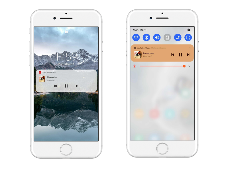
Convenient player. One can easily like the music with one click without unlocking the screen and it will be added to a Favorites folder.
HotelTonight's minimal-effort mobile booking experience
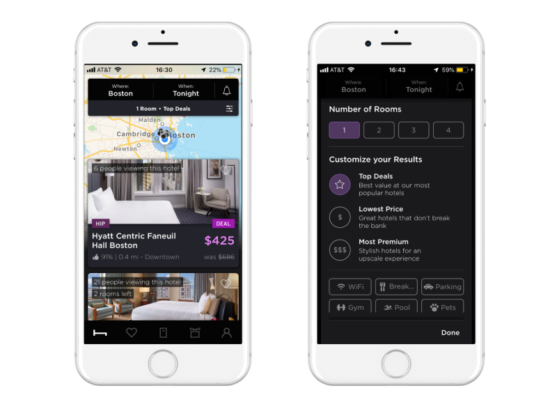
For example, we urgently need to book a room in the hotel. Therefore, we choose to share our location. And look! These are all hotels right next door! Let's apply some filters. Pressing the small slider button will most certainly bring up the filter menu.
A couple of life-hacks for #monobank clients
Monobank is the first Ukrainian mobile bank. The bank has no physical branches, so all banking transactions can be done in the mobile application without standing in line from payment of utility bills to opening an entrepreneur's account. Users only need a phone, and it only takes five minutes to become their client.
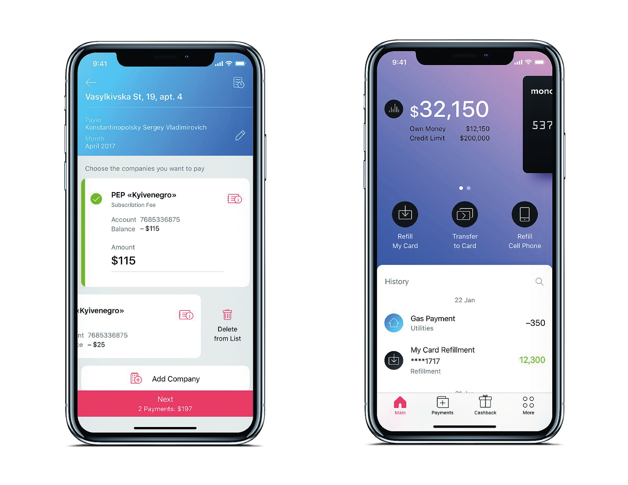
When you received message with a card number for transfer, you can copy the entire message, and the integrated Monobank system will highlight the number from the message for quick insertion in the "Transfer to card" menu.

Mobile application Duolingo
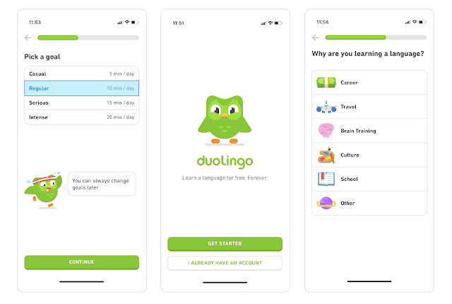
In our opinion, the Duolingo app has the correct approach to learning foreign languages. New users are asked to set a goal for language learning. They are then asked about their motivation ("Why are you learning a language?") and ask how much time per day users can spend on learning. Duolingo allows one to adapt the application experience to a specific person using a set of tools and settings.
Some useful statistics on websites and mobile applications
- Only 1 second of added page-load speed can reduce sales by 27%.
- Bad experience on mobile devices will stop 52% of users from interacting with the company.
- 83% of users say that perfect performance on all devices is important to them.
UX design principles
Have a clear system
This principle provides smooth navigation throughout the design.
Keep the sequence
Don't try to make your product radically different from other products in this field. Because users will find it difficult to perceive something new, they are used to using the product on an intuitive level, so they do not want to spend their time learning.
Controls
The app or a website should have easy control tools so that the user can easily use them, such as the search box or the scroll buttons.
Usability
The point is to make sure that each icon, button, and piece of information, that is, present in the design, has a purpose. There should be clarity that draws the user's attention only to useful features.
Usability is the reason why prominent buttons and minimalist design with several elements increase the click-through rate.
Research
First, list the goals that he must be achieved (buy or register on the site). Then online testing is conducted since our task is to observe how the user uses the interface and the product. Here everything is essential: where the user clicks, how he does it, how he moves the mouse on the screen, what emotions he has on his face and what comments he makes regarding the interface.
Then all this data is recorded and analyzed, after which the product is improved.
Conclusion
"Design is not just how it looks and feels. Design is how it works." Steve Jobs
In summary, UI and UX are great tools for finding visual and technical design solutions the user interacts with. With a design that incorporates UI and UX, you'll hit the target. You will develop a truly modern product and increase conversions, which is crucial for any startup or business.

