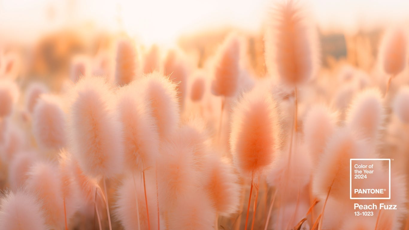
Color of the Year 2024 – Peach Fuzz
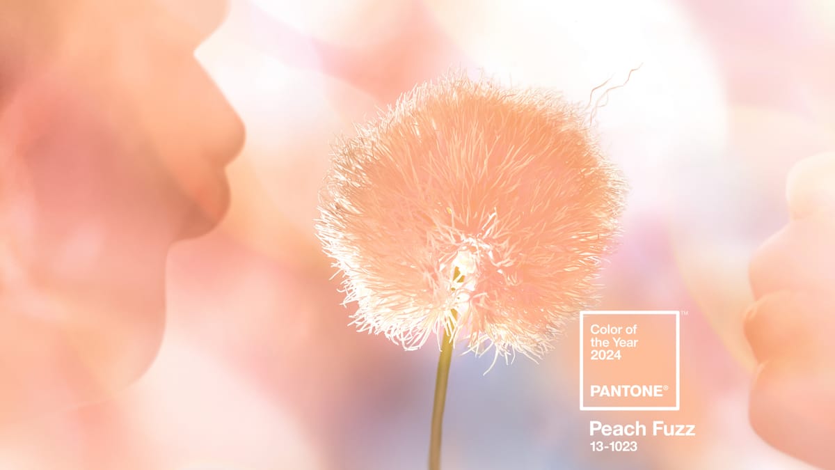
The Pantone Color Institute has chosen the Color of the Year for 2024: PANTONE 13-1023 Peach Fuzz – a velvety-gentle peach whose all-embracing spirit enriches heart, mind and body.
Іts heartfelt peach hue brings a feeling of kindness and tenderness, communicating a message of caring and sharing, community, and collaboration. A warm and cozy shade highlighting our desire for togetherness with others or for enjoying a moment of stillness and the feeling of sanctuary this creates.
Poetic and romantic clean peach tone with a vintage vibe, PANTONE 13-1023 Peach Fuzz reflects the past yet has been refashioned with a contemporary ambiance.
“In seeking a hue that echoes our innate yearning for closeness and connection, we chose a color radiant with warmth and modern elegance. A shade resonates with compassion, offers a tactile embrace, and effortlessly bridges the youthful with the timeless.” – says Leatrice Eiseman, executive director of Pantone Color Institute.
How to Use the Pantone Color of the Year 2024 – read here.
We will remind you that the last 5 Colors of the year were as follows:
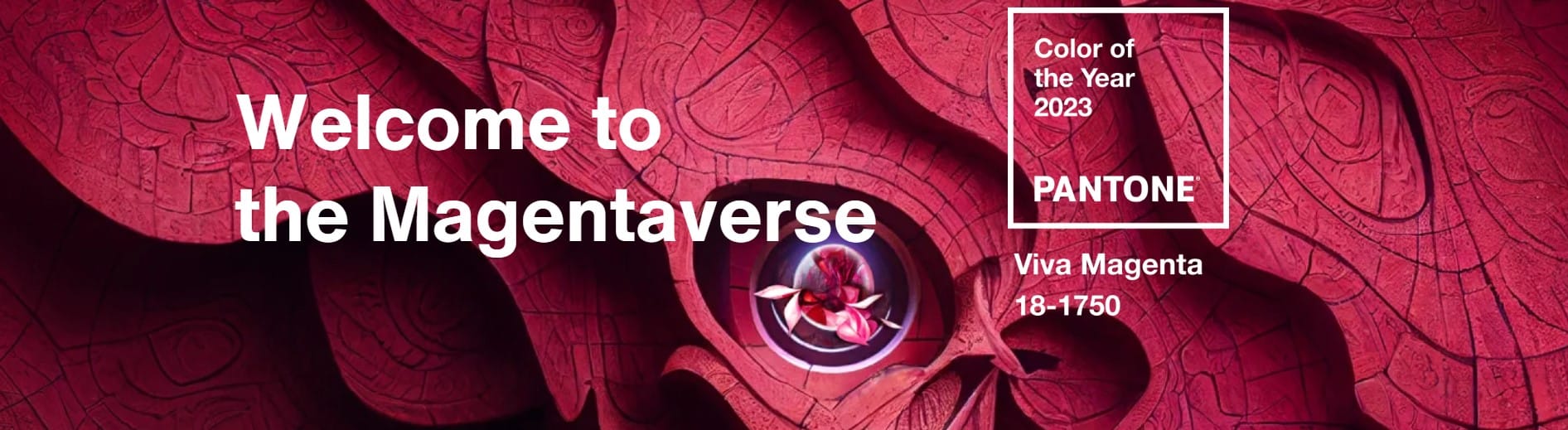
Color of the Year 2023: Viva Magenta 18-1750, vibrates with vim and vigor. It is a shade rooted in nature descending from the red family and expressive of a new signal of strength. Viva Magenta is brave, fearless, and a pulsating color whose exuberance promotes a joyous and optimistic celebration, writing a new narrative.
Color of the year 2022:Very Peri 17-3938. Very Peri is a symbol of the global zeitgeist of the moment and the transition we are going through. As we emerge from an intense period of isolation, our notions and standards are changing; our physical and digital lives have merged in new ways. Digital design helps us to stretch the limits of reality, opening the door to a dynamic virtual world where we can explore and create new color possibilities. With trends in gaming, the expanding popularity of the metaverse, and the rising artistic community in the digital space PANTONE 17-3938 Very Peri illustrates the fusion of modern life and how color trends in the digital world are being manifested in the physical world and vice versa.

Color of the Year 2021: 17-5104 Ultimate Gray + 13-0647 Illuminating – two independent colors that highlight how different elements come together to support one another, best expresses the mood for Pantone Color of the Year 2021. Practical and rock solid but at the same time warming and optimistic, the union of PANTONE 17-5104 Ultimate Gray + PANTONE 13-0647 Illuminating is one of strength and positivity. It is a story of color that encapsulates deeper feelings of thoughtfulness with the promise of something sunny and friendly.

Color of the year 2020: 19-4052 Classic Blue is elegant in its simplicity. Suggestive of the sky at dusk, the reassuring qualities of the thought-provoking PANTONE 19-4052 Classic Blue highlight our desire for a dependable and stable foundation to build as we cross the threshold of the new era. Imprinted in our psyches as a restful color, PANTONE 19-4052 Classic Blue brings a sense of peace and tranquility to the human spirit offering refuge. Aiding concentration and bringing laser-like clarity, PANTONE 19-4052 Classic Blue re-centers our thoughts. A reflective blue tone, Classic Blue fosters resilience.

Color of the year 2019: 16-1546 Living Coral: Sociable and spirited, the engaging nature of PANTONE 16-1546 Living Coral welcomes and encourages lighthearted activity. PANTONE 16-1546 Living Coral embodies our desire for playful expression, symbolizing our innate need for optimism and joyful pursuits.

Why does Pantone pick the Color of the Year?
Pantone is in the business of color. Since 1963, Pantone has provided color solutions. Today Pantone’s color language is used by designers worldwide to access color trends, communicate color choices, and control the consistency of color across every imaginable surface, texture, material, and finish.
Founded in 1985, the Pantone Color Institute educates, inspires, and promotes fluency in the language of color. Executive Director Leatrice Eiseman, who helped to start the Pantone Color Institute, has a background in color, design, and psychology.
Who decides Pantone Color of the Year?
To arrive at the selection each year, this global team of color experts at the Pantone Color Institute combs the world in the search for new color influences. That can include the entertainment industry and films in production, traveling art collections and recent artists, fashion, all areas of design, aspirational travel destinations, new lifestyles, playstyles, or enjoyable escapes as well as socio-economic conditions. Influences may also stem from new technologies, materials, textures, and effects that impact color, relevant social media platforms, and even upcoming sporting events that capture worldwide attention.
Anything and everything taking place in culture during the year can influence Pantone Color of the Year selections for the upcoming year bringing a different weight from year to year with each source depending on what is taking place in culture at the time. For example, if you look back to 15 years ago, technology would have played an infinitesimal role. Today that's no longer the case. Gaming, social media, AR, and physical design itself – are all influenced by our technology and the colors we can access in the digital environment. – writes panton.com.